Date uploaded: 2017-07-21 20:33:49
Archive date: Sat, 25 Dec 2021 01:55:13 GMT
.
.
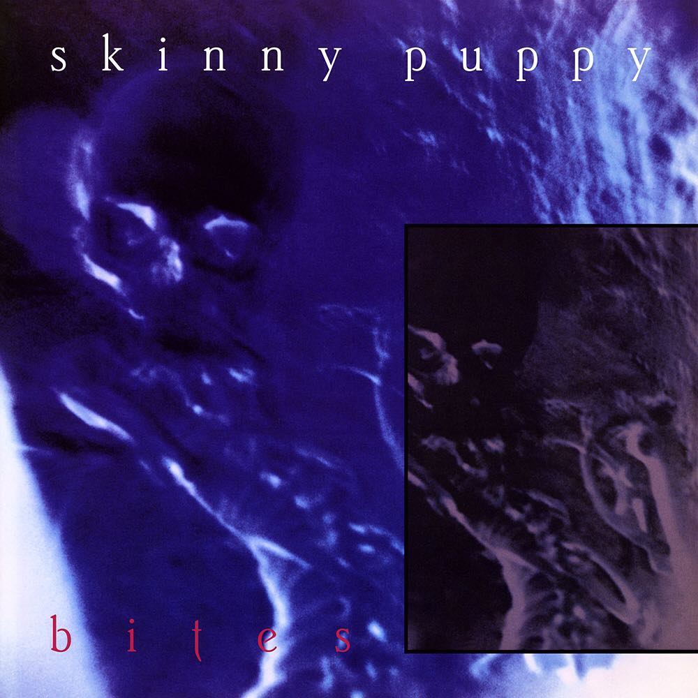
At times we are all consumed with trivial pursuits. For me over the last several years it has been trying to figure out what typeface I used for the front cover of Skinny Puppy's "bites".
.
When I designed the sleeve in 1985 (32 years ago) I had limited access to and budget for a typesetter so most of my main title designs were created either by hand, by lifting typefaces from type specimen books or using Letraset (a form of dry rub-down instant lettering). I knew in the instance of "bites" I used Letraset but I couldn't for the life of me remember the name of the typeface.
.
After seeing a post of old Nettwerk cassettes on my Facebook timeline yesterday it got me thinking about it again. By scouring images of vintage Letraset sheets last night on Google I eventually ran across it. Which was probably by pure luck I might add. It is Brighton Light and amazingly it is now available as a computer font.
.
The reason why I have been pursuing this quest for so long is because I have always felt that the color separator made the hue of red used for "bites" too dark and I wanted to create a proper version for my 80s portfolio. Once I found out what typeface it was I immediately tracked down the font and used it to make the correction (which you see here).
.
Was it worth all those hours of my time or posting about it on Facebook and Instagram? Probably not. But at least I can now put that nagging obsession to rest. 😜
.
#skinnypuppy #bites #srgdesign #stevenrgilmore #ogre #cevinkey
